
Less Presence, More Order | Cubox Browser Extension Update
Have you ever tried to select text on a webpage, only to have an extension menu pop up and block what you're doing? The more extensions you install, the worse it gets.
Most extensions act like they're the only tool you use. Cubox used to do the same.
But reading requires deep focus.
To eliminate this friction, we've completely rethought how the Cubox extension behaves. Version 7.6 is now live across all browser stores, designed to bring quiet back to your reading.
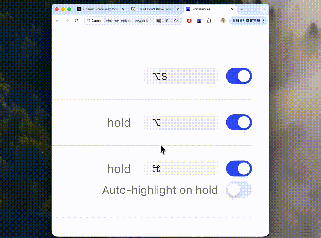
⌨️ On-Demand Access: Giving Control Back to You
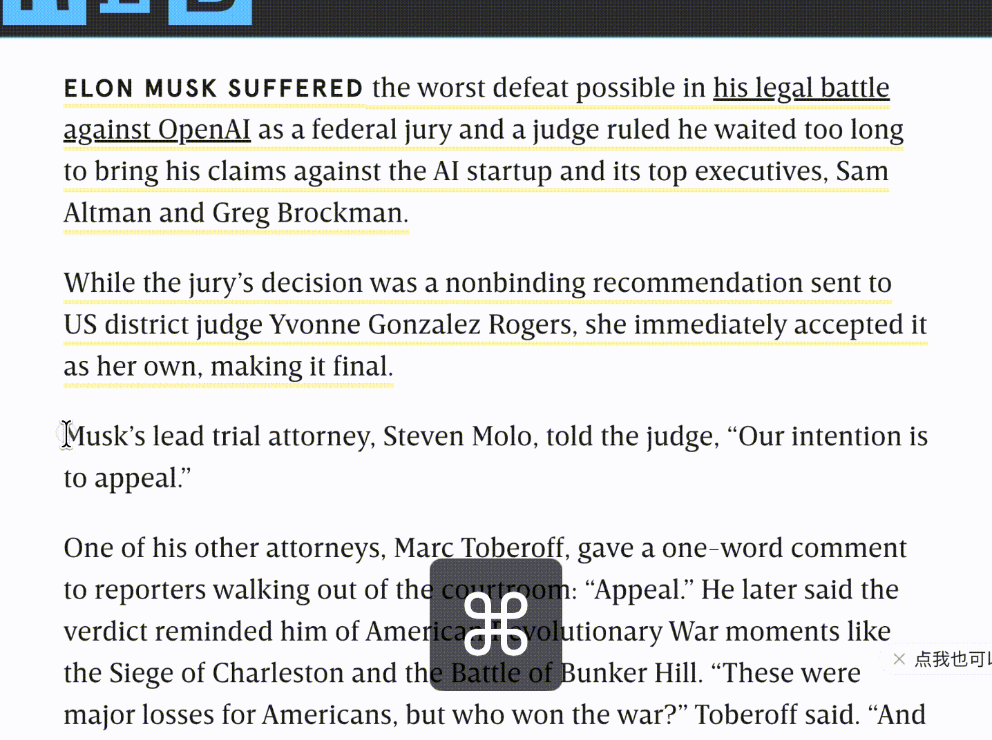
By default, the new extension stays absolutely silent. Normal text selection and copying will no longer trigger the Cubox action menu.
It only appears when you actually need it. Just hold down your designated shortcut key (configurable in the extension settings) while selecting text, and the menu will show up.
We've also made it smarter about where you are typing. If your cursor is in an input field, like a comment section or a CMS editor, the shortcut won't trigger the Cubox menu. This ensures you can use your standard system editing shortcuts without any annoying conflicts.
⚡️ Auto-Highlight: Seamless Capture
If you highlight text frequently, even one extra click can break your flow. That's why we've introduced a new "Auto-highlight" setting.
When enabled, highlighting feels as natural as putting pen to paper. Hold the shortcut key, select your text, and the moment you release your mouse, the highlight is saved.
No extra clicks. Your thoughts are captured the second they happen, and saved securely to your Cubox alongside a full web snapshot.
We've also optimized the snapshot engine itself to capture context more reliably and quietly in the background.
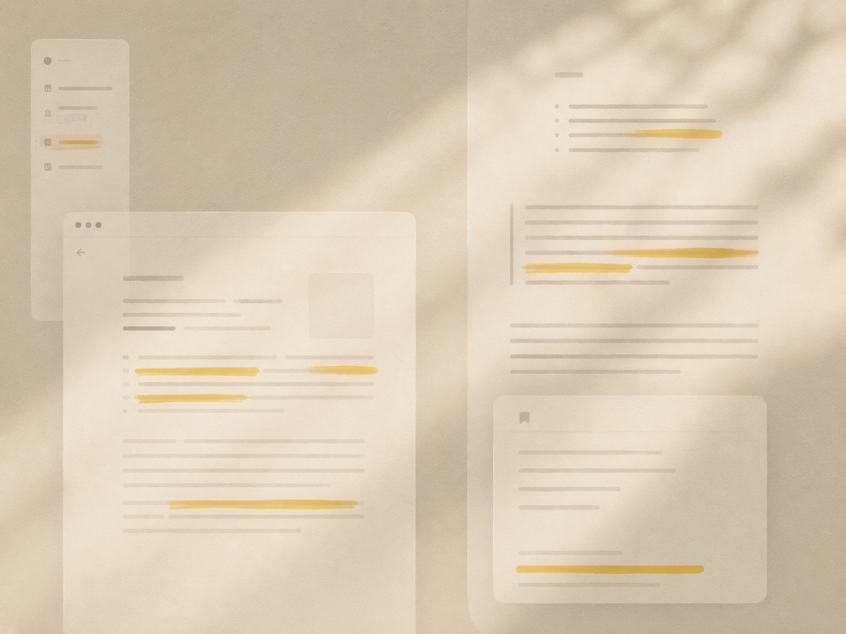
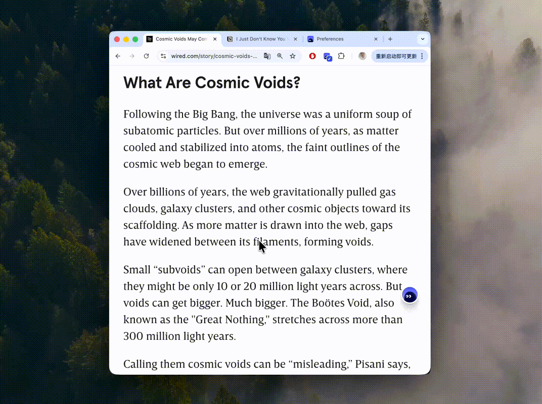
🎨 A Cleaner Highlight Style
We've moved away from the familiar translucent background blocks. Highlights are now represented by clean, crisp underlines.
The old marker style looked great on white pages, but as web design has evolved, especially with dark modes and tinted backgrounds, we needed a visual approach that works perfectly everywhere.
The new bold underline is our solution.
It bypasses background color conflicts entirely. No matter how complex the website's design is, the underline maintains high contrast and sharpness, keeping your reading experience tidy and organized.
And we didn't sacrifice usability for aesthetics. While the visual footprint is smaller, the interactive hit area remains exactly the same, making hover actions just as effortless as before.
💻 Unified Visuals Across All Platforms
Cubox annotations work across multiple devices, including our newly launched E-Ink app. We've rolled out this new underline style to all our clients to ensure a consistent, unified experience everywhere you read.
Visual preferences are subjective, but the desire for a clean, focused reading environment is universal. Balancing different workflows is always a challenge, and we'd love to know how this update affects your daily routine.
Give the new highlight experience a try, drop us a review in the extension store, and let us know what you think. Let's keep building a better space for your reading!