Cubox Tab Bar Optimization丨UX Boost Program #03
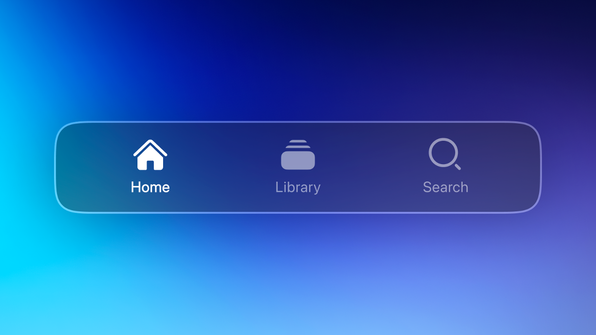
Cubox's Tab Bar has been simplified to three tabs: Home, Library, and Search.

👋 Meeting again, Cubox has introduced an important change: in the new version, Cubox's Tab Bar has been simplified to three tabs: Home, Library, and Search.
Whether you are new to Cubox or already familiar with the previous interface, you can quickly get started without facing too many page options. In the following content, we will walk you through the main changes and share the thoughts behind them.

🎈 Effortless Organization in One Page
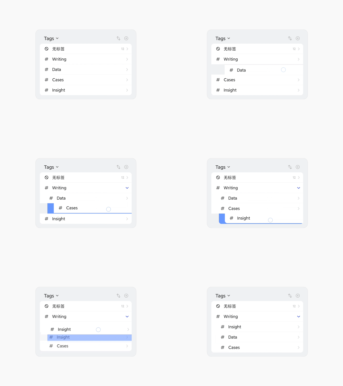
The new Tab Bar merges the Tags list into the Library page, located below Folders.
Folders and tags can be used separately for different management methods, catering to various user needs for data organization. They can also work well together—folders for major categories and tags for thematic organization.
In the latest design, Cubox combines them into one page, eliminating the need to switch back and forth. Previously, organizing content required managing folders and tags on two separate pages, which was inconvenient.
If you have many folders and tags, you can collapse sections to focus on what matters most. Use Search to directly access related lists, allowing quick content organization.
When managing tags and folders, swipe left or right to select the desired tags or folders. Long-press to move them up or down to change their order, and long-press with indentation to set nested structures.

Cubox might be the only reading tool on the market that supports infinite nesting structures for folders and tags. This powerful organizing capability will show its unique advantages in different scenarios. Every folder is a theme, and every tag is a node. In future updates, whether through AI or sharing capabilities, this seemingly classical and complex management method will gain new vitality.
🤔 Rethinking the "+" and Memos
In addition to the changes in the Tags list, the "•••" More option on the original Tab Bar has been moved to the top left corner of the main page. More importantly, we have removed the "+" button from the center of the original Tab Bar, but you can still find it in the top right corner of major pages to manually add memos, links, images, and files.
Why did we make this change? Initially, Cubox's saving feature was designed for web content reading, and the most common way to save was through extensions. Manual saving is less efficient compared to extension-based saving. Therefore, manual saving served as a supplementary feature. If you want to know all the ways Cubox supports saving content, you can check the Help & Support documentation.
Especially for Memos, due to its simple and lightweight functionality, it is not considered a serious writing tool. It is more suitable for recording fleeting thoughts during web reading.
In this context, we believe that downplaying manual saving in the client will help guide new users more effectively and allow our team to focus on more relevant functional iterations—we have so much to improve in web content saving!
We also understand that many users have saved a large number of Memos over the years and gradually hope for support for Markdown format and Review features. However, after evaluation, the Cubox team believes that in the short term, it is difficult to develop these features to our satisfaction. Comparatively, we have more important, reading-related issues to address.
True power comes from focus. But the team's attempts have not stopped; we will consider integrating Memos better into the reading process and finding its most suitable "reading" scenario.
For quick idea capture, if Cubox doesn't meet your needs, we also encourage you to try other excellent applications dedicated to capturing ideas. We apologize for any inconvenience caused to frequent Memos users by this change!
Although we have removed the Memos entry from the Tab Bar, Cubox still retains quick ways to capture ideas. For example, you can long-press the app icon on mobile, use the desktop widget, or use the Mac Assistant shortcut to quickly open Memos.
🔍 Search at Your Fingertips
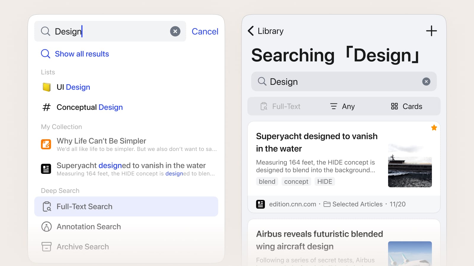
"Search" has now been added to the Tab Bar.
Cubox already supports quick search for titles, descriptions, and links, full-text search, and annotation search. However, based on user feedback, we have also identified areas for improvement in search, as some scenarios are still lacking.

In future versions, we will deeply refine "Search". The new search features will involve AI, focusing on how AI can help you discover and organize content. Let AI handle tedious work, so you can focus on reading. These new ideas require Search to have a dedicated page to accommodate rich possibilities, which is why we made this change.
📖 From Saving to Reading
Recently, Cubox has improved the efficiency of content saving. The speed of browsing information doesn't equal content depth or growth. When content comes too quickly, we consider how to make it valuable. Collecting isn't the same as reading, and reading isn't the same as understanding. Only through deep reading and review can knowledge be gained.
Under the new Tab Bar structure, Cubox prioritizes content, followed by management. When you open Cubox, you quickly enter reading mode. We help you remember your last reading status.
If you were reading under a specific folder or tag before leaving, Cubox will open the same folder or tag by default, quickly returning you to the reading context. You can quickly switch to Home or Search from other pages.

A small preview: we will combine the Read & Unread function, optimize the "Inbox" list, and provide automatic next article reading, significantly enhancing the reading experience.
Other Optimizations and Updates
- Fixed an issue where data synchronization (rebuilding the database and preparing the data) continued to fail when importing bookmarks or performing certain batch operations on the data.
- Optimized memory usage for large data synchronization. Device memory usage during app initialization or large data synchronization has been significantly reduced, lowering usage by 60%-70%, making Cubox run more smoothly.
- Fixed the issue with the iOS Memos widget where it could not jump directly to edit mode. In the new version, clicking the widget will allow you to directly edit Memos.
- Added a colorless background style for the Home page. Try scrolling down the Home page to a certain position and you may find a small surprise.
- Optimized and unified the application's Chinese and English text, including the Tab Bar, Tags page, and Settings page.
- Fixed other known issues.
This UX Boost plan update is still part of the recent "Reading Process Optimization" system. We will continue to focus on user feedback in future updates, aiming to create a more comfortable and seamless reading lifestyle.
